No matter what industry you are in, you certainly know the importance of marketing and advertising. Effective advertising can help you stand out from the competition. There is perhaps no industry where this is more important than in the restaurant industry. With quite literally millions of options to choose from, people will be drawn to restaurants with good advertising. Thus, it’s crucial that your restaurant’s advertising stands out. Need some restaurant billboard ideas and tips? We’re here to help!
The most effective and successful restaurant billboards contain striking images, plays on words and humor, or details that make onlookers do a double-take. With a clever and out-of-the-box billboard design, people are sure to take notice and flock to your restaurant. Here are some of our favorite designs to help generate some restaurant billboard ideas.
Restaurant Billboard Ideas and Tips
While there are many different directions you can take your restaurant billboard design in, there are some standard guidelines you should follow. These include, but are not limited to:
- Using contrasting colors and elements
- Highlighting a new product/dish
- Play with angles and perspectives for a clever touch
- Partner with local and seasonal events
- Experiment with sizing
- Get creative with fonts
With this in mind, here are some great examples of effective restaurant billboards that have done some of these things.
Compare and Contrast
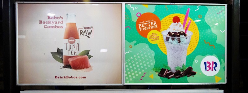
As part of an intricate advertising campaign from Outfront Studios, Baskin Robbins created billboards, posters, and even web landing pages with the theme of: “some things go better together.” The agency created a fictitious company called Bobo’s Fish Juice that featured some eyebrow-raising flavor combinations. These faux-healthy advertisements were then placed side by side with delicious images of Baskin Robbins shakes.
Though Baskin Robbins is not known to be a healthy choice, the advertising campaign managed to make healthy ingredients look less desirable using an artful compare and contrast. Color schemes, images, and even tone are subtle ways to compare and contrast products to highlight your restaurant. As seen in this example, conceptual contrast and color contrast can work together in a very effective way.
Highlight a Product
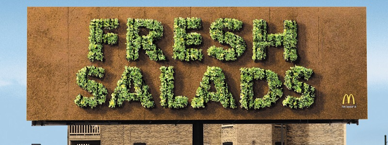
McDonald’s created an ambitious campaign to promote the quality and freshness of its salads. The hamburger chain planted thousands of heads of lettuce on a billboard made of soil. Over three weeks, the bare billboard sprouted full blooms of fresh green lettuce spelling out “FRESH SALADS.” The innovative advertisement boosted sales by 30%, and 500,000 salads were sold during the campaign period.
McDonald’s also ran similar campaigns with a carrot bus stop advertisement and a giant hatching egg outside another store location. This was a great example of creating hype around a specific dish or ingredient by highlighting it.
One great thing about the restaurant industry is that you have a universally-appealing product to advertise to people: food. High-quality food photography can make all the difference with your restaurant’s out-of-home advertising. Imagine you are driving home from work and can’t wait to eat. If you see a huge billboard depicting a delicious-looking pizza, you’ll be much more inclined to read where that pizza comes from and go and purchase it.
Play with Perspectives
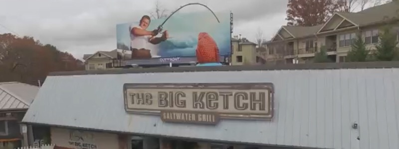
This restaurant billboard idea for a seafood restaurant caught a lot of eyes. The actual advertisement is comprised of two parts: The billboard in the background, and the plastic fish emerging from the top of the actual restaurant building. From this angle, both elements of the advertisement look like they are all one piece. However, the billboard is a few yards away behind the building that the fish rests on.
This billboard uses perspective and optical illusion to make the fisherman on the billboard look like he’s reeling in an extremely large fish. This is an interesting way to capture and keep the attention of viewers, as the fish and fisherman will appear to move depending on where the viewer approaches from.
Partner with Local Events
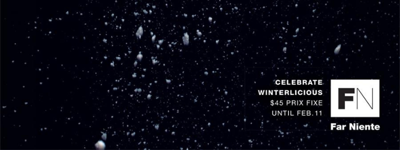
This upscale restaurant in downtown Toronto participated in the annual Winterlicious event by offering a special prix fixe meal. Though many restaurants in the area participate in the event, Far Niente took it one step further. The concept art is simple, depicting salt, flour, and cheese being sprinkled against a black space. However, the simple images use restaurant ingredients to invoke the image of snow falling on a winter’s night. This ties directly into the event it is participating in.
This ad run shows us a creative way to incorporate local events in restaurant advertisements, and how seasonal advertisement can be impactful. Seasonal advertising is quite effective with billboard advertising, as you can keep a seasonal billboard up for short or long periods of time, depending on the time of year you’re appealing to. Plus, you can run similar campaigns while appealing to different seasons, and your audience will be excited to see what you’ve come up with next.
An Excellent Use of Cutouts
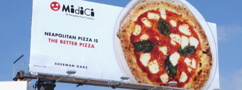
MidiCi pizza used a three-dimensional cutout to make the shape of an otherwise typical billboard irregular and eye-catching. The plate seems to hang off of the billboard. Furthermore, the bold green and red tones of the pizza advertised pop against the otherwise pristine white plate and background.
The use of three-dimensional cutouts and color is an easy way to showcase specific products or dishes on your restaurant billboards. Playing with sizing, including making certain elements of your billboard larger than the others, or playing with shapes as this one does, is a great way to make your billboard stand out from the rest.
Contrasting Text
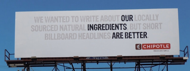
Chipotle ran this billboard advertisement that also invites another look. Onlookers immediately see the target message in bold black text: our ingredients are better. However, a second look reveals another message about locally sourced natural ingredients, and even includes a dose of humor.
This artful use of contrast text and a message-within-a-message is deceptively simple, but Chipotle has accomplished not one but two important marketing messages about its ingredients in just a few seconds. Consider playing with bold contrast to deliver two messages for the price of one in your own restaurant billboard.
How bMedia Can Help
The advertising experts at bMedia are the leaders in out-of-home advertising in Puerto Rico. No matter what industry you find yourself in — including the restaurant industry — bMedia can help you find the right audience at the right time in the right place.
With hundreds of billboards in locations island-wide, you are sure to find the spot that’s right for you and your business. Here at bMedia, we use tried-and-true best practices and strategies to optimize your advertising budget and produce a spectacular return on investment. To learn more about how bMedia can help your business reach its maximum advertising potential, contact us today!




 787 792 4113

Leave a Reply
Want to join the discussion?Feel free to contribute!