Inspiration for effective marketing often comes from the most unexpected places, or fresh ways of looking at something. Even symbols one has seen their entire lives can take on a new meaning, or new technology can create ways to interact with the marketing world. Here are 5 examples of billboard design inspiration that came from unusual sources or clever re-imaginings.
Play-Doh: Open a Jar of Imagination
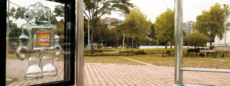
Annually every April, parent company Hasbro comes up with a new marketing technique just in time for Children’s Day. In 2018, the company announced the launch of the “Open a Jar of Imagination” Play-Doh campaign. This year, the company is championing encouraging children’s imagination and play. With this unique billboard structure, commonly featured in bus stops and eye-level billboards, the viewer is invited to use their own creativity to see beyond a basic can of play-doh to imagine what it could become. The limited-edition cans are surrounded by a clear plastic mold of children’s motifs like robots, airplanes and frogs.
The billboard is designed superbly well, and offers multiple levels of connection to the viewer. The clear plastic molds surrounding the vibrant can of Play-Doh showcase the product extremely effectively, while the sight of the can inspires nostalgia for adults and excitement for children. Finally the idealism behind it, in imagining what the product could be rather than just what it is, speaks to the hearts of clientele.
#BetterOff Billboard for Earth Day
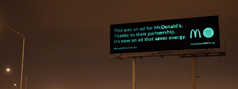
Sometimes the most effective design for a billboard is the simplest. This was demonstrated over Earth Day, when Energy Upgrade California put together a campaign called #BetterOff. The concept of the campaign was simple and revolved around cutting down energy expenditure in the state. Accordingly, EUC asked McDonalds to turn the lights off in their billboards, which the burger chain complied with. During the day, a normal billboard featuring McDonalds products including a signature sandwich. However, as the sun set over California the board went dark and a special message was revealed on its surface, using glow in the dark tape. The message read, “This was an ad for McDonalds. Thanks to their partnership, it’s now an ad that saves energy.”
With low cost and maximum impact, this is a fantastic example of an outdoor advertising campaign. This approach in particular would work for a company with a special campaign or message. The gradual change captures viewer interest, and the simplistic glowing letters on a dark background grabs the eye and leaves room for thought.
“Follow the Arches” McDonalds
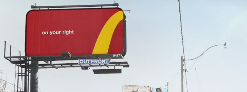
Canadian creative agency Cosette noticed that road signs for McDonalds all over Canada had inconsistent branding. While every sign incorporated the signature golden arches, the similarities ended there. In an effort to make branding more uniform and directions to each location more streamlined, McDonalds embraced providing directions with the golden arches themselves.
Using segments of the arches, such as the left bottom portion of the arch to directionally “point” to a McDonalds on the right, or the center of the arch to directionally signal to get off on the next exit, McDonald’s is able to simplify within their established branding and provide directions to their customers in a truly genius way. All it took was looking at the signature golden arches in a new way for some solid billboard design inspiration.
“The Mind Reading Billboard” Quebec City Magic Festival
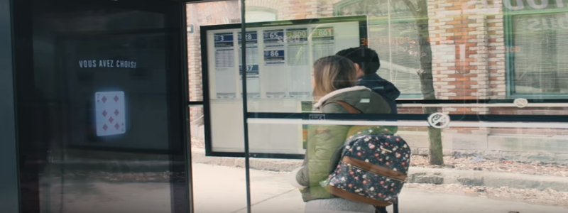
Just in time for the Quebec City Magic Festival, agency Lg2 installed an interactive billboard in a popular bus stop to promote the event. Using recently developed technology that is being used in major retail and restaurant chains to glean marketing data, the agency is bringing smiles to Canadian citizens.
A person will move closer to the digital billboard and be prompted to pick a card and keep it in their mind’s eye. The billboard will then reveal the card you were thinking of, “reading your mind.” Of course, there is advanced eye tracking technology behind the screen that follows the users gaze in order to accomplish this, but it brings joy and entertainment nonetheless. This outdoor media is a perfect example of using cutting edge billboard technology as inspiration to capture and engage viewers.
“Fun Magnet” by Fallsview Casino
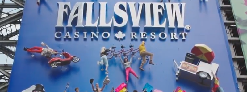
This past winter, Fallsview Casino and Resort in Niagara Falls commissioned an enormous billboard in Dundas Square. The enormous blue billboard towered 40 x 73 feet above the square and was entitled “Fun Magnet.” Installations of mannequins on parachutes, mannequins barely hanging onto full motorcycles and even a hot dog car were bolted onto the installation as though they had just been stuck to the board with a magnet. Prominently in the center was the logo for the casino.
The design for the billboard was truly incredible, with a high attention to detail and no expense spared to bolt full vehicles and mannequin fixtures to it. The attention to detail and 360 degree marketing experience didn’t end there. A local agency proceeded to make a supporting documentary for the making of the billboard, following three mannequin “celebrities” sharing their thoughts and respective journeys to Dundas Square.


 787 792 4113

Leave a Reply
Want to join the discussion?Feel free to contribute!