Anyone who’s ever driven down the highway can tell you that not all outdoor media is created equally. Some fail to stand out, most are straightforward and simple. But there are a select few creative billboard ads that really make an impression – and those are the ones that we want to learn from. There has been much discourse in the past about what makes a “good” billboard. However, it might be easier to look at some of the most creative ones to see what really makes a billboard stand out from the rest.The first two ads we’ve got show the importance of utilizing the surrounding area. Sure, you could put a plain advertisement on a billboard just about anywhere. But if you’ve carefully chosen your location, you can make great, creative billboard ads like the ones below.
1. Berger’s “Sky” ad.
This outdoor media is optical illusions 101 – it uses careful framing to create a surreal image. In this case, it makes the viewer think a man is painting the sky. You might be too surprised the first time to absorb the brand, but you’ll look more closely the next time you pass.
2. Koleston Naturals’ Beachside ad.
Koleston uses a bit more of a straightforward approach here. The advertisement is clear to see, but the clever use of scenery and lighting makes it much more memorable.
In the vein of advertisements that make smart use of space around them, there are some ads which work almost exclusively due to the perspective they’re viewed from. Such ads can only be used in limited ways, but they’re doubly efficient for their specific placement.
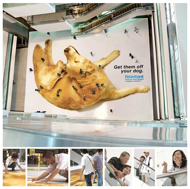
3. Frontline’s Floor Tick ad.
This neat advertisement from Indonesia utilizes the pedestrians themselves as part of its advertisement. The pedestrians could probably look down for a moment and figure it out, but the true viewers are the ones looking from above. If you are one of those viewers, this ad will really stand out.
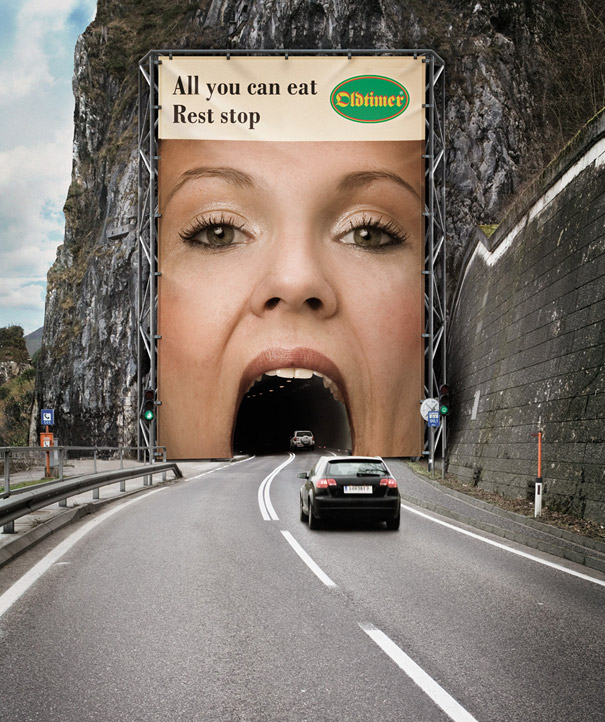
4. Oltimer’s Tunnel ad.
A fairly unsettling billboard, depending on your sensibilities. But it’s no less effective or impactful: you definitely get the idea. This ad uses the cars as part of the advertisement, just like the tick one, but in a much more direct way.
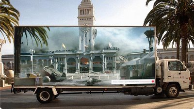
5. Red Cross Earthquake Illusion series.
Not just a single ad like the others, this was part of a series of billboards made by the Red Cross to help advertise the importance of earthquake preparedness. Whether or not it greatly improved public safety is hard to say, but it was certainly a great stroke of advertising prowess.
For those who are willing to make it happen, you can find great success with adding special effects to your billboards. All the ones we’ve looked at so far were plain, but well-planned advertisements. Now let’s look at some that use extra effects to get the point across.
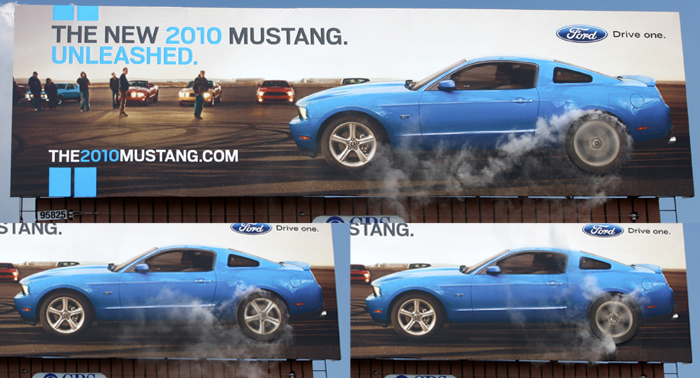
6. Smoking Mustang ad.
It’s hard not to look when you see smoke in the air – something Ford knew all too well when they put out their smoking Mustang ad. This billboard uses periodic puffs of smoke from the wheel area to draw attention to a faux burnout– talk about an eye catcher!
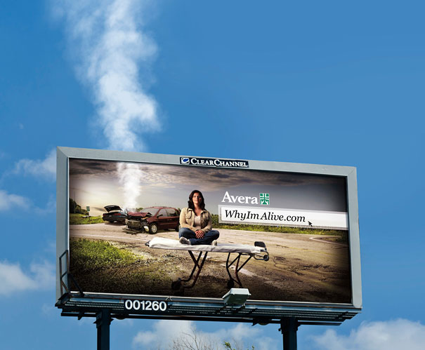
7. Avera’s Smoking Car ad.
In contrast to the Mustang ad, this billboard uses smoke to draw attention to the scene of a crash. This makes the idea of the Avera medical support seem extra dramatic. After all, car crashes are the exact kind of sudden occurrence that makes insurance so important.
8. Cannes Crying ad.
This ad uses two simple nozzles to create a crying effect on the billboard, in addition to the actual tears shown in the picture. It’s plain, and probably easy, but it has a charming effect once you notice it.
On the topic of the liquid using crying advertisements, there have been a few billboards from different companies that are set to react to the rain. These may or may not include actual liquids being used.
9. Calvin Klein Wet Nightie ad.
It’s no secret that sex sells. And what could be better for the rain-distracted driver than this sudden, titillating display? Disregarding any potential concerns of distraction, there’s no way this ad will go unnoticed when the rain comes down.
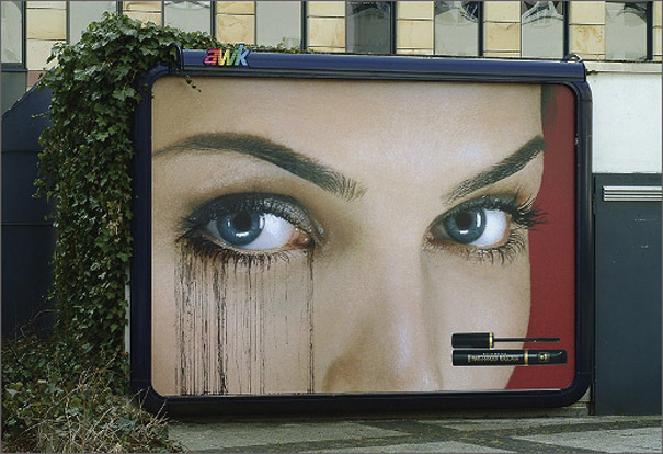
10. Max Factor’s Running Mascara ad.
Max Factor isn’t here to sell you any big claims about waterproof mascara. This is normal mascara, plain and simple – the billboard is just there to get your attention once it rains. It works.
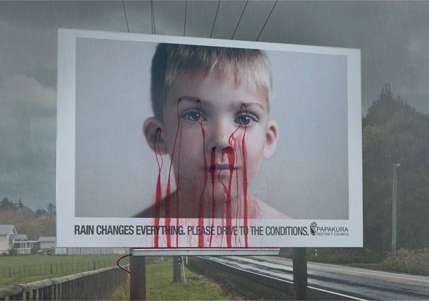
11. Papakura’s Bleeding ad.
Papakura’s district council in New Zealand has had enough of unsafe driving, and it shows. This hard-hitting (and questionably appropriate) advertisement puts the consequences of reckless rainy driving in perspective by leaking red fluid whenever it rains. Harsh, but effective.
Speaking of harsh, billboard advertising isn’t always fun and games. Sometimes, you can use the space of a billboard to address a really serious matter.
12. Escape Abuse ad.
The impact of this creative billboard ad makes it hard to add anything to the discussion – it really speaks for itself. Absolutely visceral through its simple presentation, with the addition of a bedsheet rope to accentuate the point.
13. Speeding Consequence ad.
Almost everybody looks at the speed markers on the side of the road. Some of us, to adjust our speed, and others, to see how much more we can push it. But regardless of how you drive, this advertisement is sure to grab your eye.
The last surefire way to get eyes on your billboard is by investing in an additional prop. This might mean designing the board differently, or perhaps establishing a whole prop in front of it. Here are two great examples of the technique:
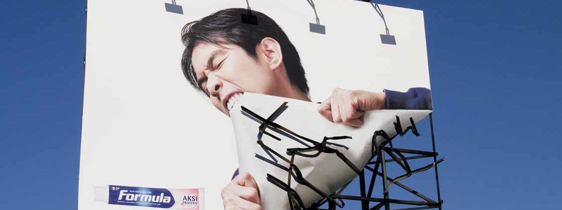
14. Formula Billboard Bite ad.
This billboard is another simple, effective one. You know exactly what it’s saying: Formula gives you strong teeth! All it takes is a little creative design on the billboard, and your ad can be just as concise.
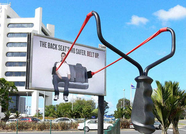
15. Backseat Ejector ad.
If you’re passing by this ad too quickly, you might miss it. But once you see it completely, it’s quite a powerful message. So powerful, in fact, that the Colorado Board of Transportation faced some flak after putting them up. Controversy means it worked, though; people definitely talked about it.
The Best Creative Billboard Ads
As you can see from this list, the best billboards are those that escape the “extra-big, but otherwise normal advertisement” way of thinking. This can be done in a variety of ways: by using props, by using clever staging, or even just good design. If you think that putting water nozzles on your billboard will help, it can probably be done, and the interest you generate will often be more than the effort it took. Consider the location of your billboard and the nature of your brand; the possibilities are endless when it comes to billboard advertising.








 787 792 4113

Leave a Reply
Want to join the discussion?Feel free to contribute!