Advertising is all about creating associations. People who see a clear message alongside your brand will connect the two in their mind even if they don’t consciously realize it. But this effect is a double-edged sword; if someone attaches their brand to a poorly made advertisement, it can really hurt their image. Of course, if an advertisement is so bad that it’s funny when people share it online. So these advertisements are either fails or successes depending on whether or not you believe that all publicity is good publicity.
Yahoo 404 Error?
For any website, serving a user up a 404 error is an embarrassment. For one of the world’s largest search engines, producing a 404 should probably never happen, so the unfortunate number placement in this baseball stadium next to the Yahoo banner makes for funny advertising fail. Location always matters!
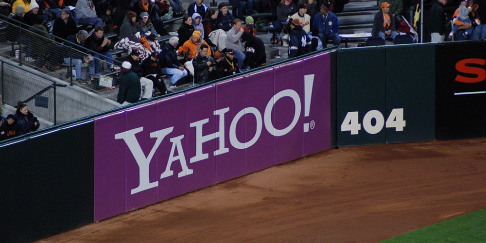
For any website, serving a user up a 404 error is an embarrassment. For one of the world’s largest search engines, producing a 404 should probably never happen, so the unfortunate number placement in this baseball stadium next to the Yahoo banner makes for funny advertising fail. Location always matters!
What Does That Say?
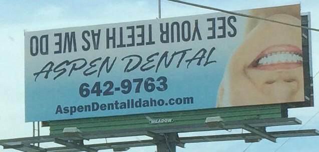
If you’re having trouble reading this on a screen that’s standing still imagine trying to read it while you drive past at more than sixty miles per hour. This sign seems like a real traffic hazard. Even if you can read it the slogan “see your teeth as we do” doesn’t feel worth the effort required.
Hunters and Hygienists
So I’m confused, are they holding my dental hygienist hostage? Listen, it’s great if you have hobbies and sometimes you can even work your favorite pastime into your ad campaign. But your job and your hobby need to align in some way for it to work. All this sign makes me think of is my teeth mounted on the wall beside some antlers.

Quality Control is Crucial
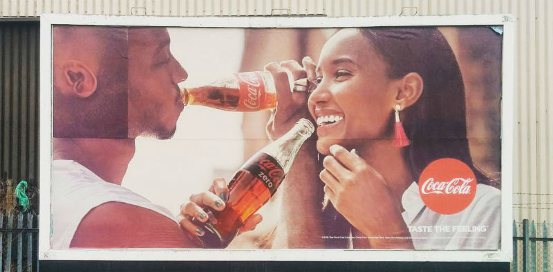
Even great designs can blow up in your face if the idea isn’t executed correctly. This ad must have looked great on the screen it was designed on but because the people putting the sign up didn’t put care into their work the whole impact was ruined. It just goes to show how important everyone, from the ad executive down to the person who actually has to physically put the ad up.
Diabetes, Straight Ahead
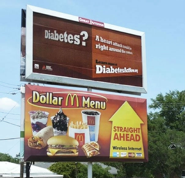
This sign placement is either incredibly unfortunate or ingenious. If the diabetes sign was there first, then McDonalds made a huge mistake. But if the McDonalds sign was the original sign then the people at the Ad Council found a great way to spread their message and make people question their unhealthy eating habits.
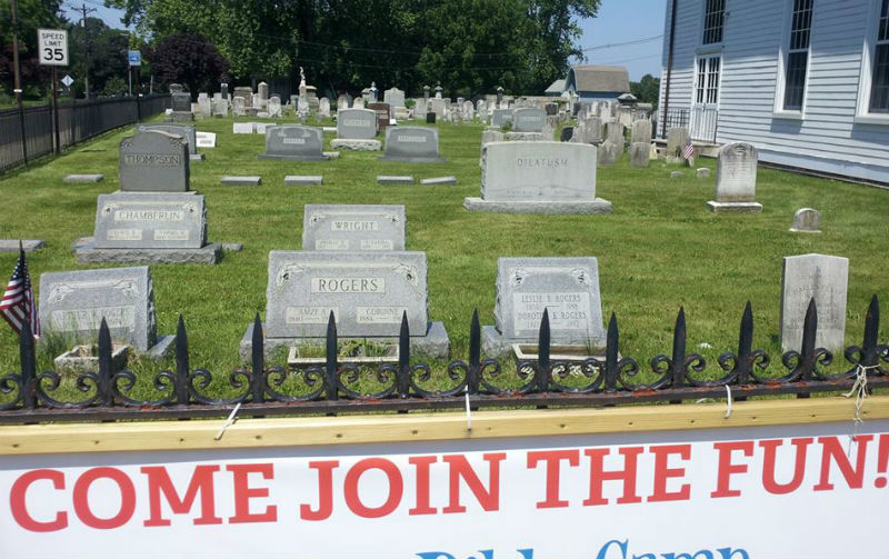
Join the Fun!
Because of the way the picture was cropped we can’t tell what the full sign says. What we can say for sure is that this sign seems to be encouraging people to die, and that’s always going to be a bad advertising move.
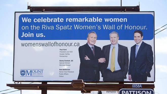
Celebrating Remarkable Women
Mixing social issues and personal promotion always requires a tricky balancing act and the people behind this sign handled the challenge with the grace of a boozed-up bull in a china shop. Honoring women is a worthy goal, but when that’s your goal you probably don’t want to make it look like your company doesn’t have any female leadership.
Love Your Curves
On the topic of mixed messages, here we have another case of good intentions and poor execution. If you want to sell your product to women who identify as curvy, then you should probably hire some models who aren’t so skinny. This advertisement manages to feel pandering, tone deaf, and insulting all at once. In that way, it’s actually quite an accomplishment!

This is Bland Flavor
Always triple check your font choice. Look at it yourself, show it to a friend, then show it to a stranger. If the designer behind this ad followed those steps, someone might have pointed out that the cursive I and S come together to look like a B, turning “island” into “bland.” It doesn’t help that the food in the picture ranges from black to brown to white. A little bit of garnish might wouldn’t have hurt.

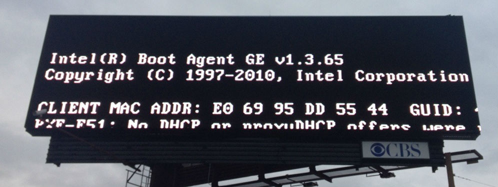
Technical Error
Just as technology has opened up new avenues for success, it has also created plenty of new chances for failure. In the old days, a billboard ad would never need to be rebooted. Then again, this might be a good advertisement if it was put up by one of Intel’s competitors as a way to paint their products as faulty.
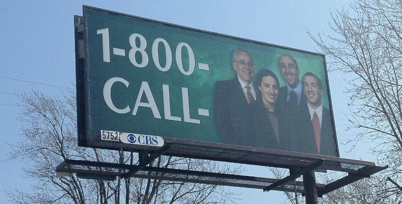
1-800-CALL
Last time I checked 1-800 numbers needs a few more numbers than this. What are the last three numbers? I know that CALL translates into 2255 but what three numbers do you get out of four generic looking lawyer types? Who thought this sign was complete? So many questions, so few answers.
For more humorous advertisements check out our article on: Funny Signs and Billboards.


 787 792 4113

Leave a Reply
Want to join the discussion?Feel free to contribute!