Billboards are a classic site alongside roads throughout the world, but most of them are fairly similar. They have roughly the same dimensions, don’t contain too much information, and are designed to get a simple message across to people who won’t have much time to view it.
On the other hand, quality billboards go much further. They follow a strong strategy, and they’re put together in a way to be very memorable. Some even go to extreme lengths to make them unique enough that people want to talk about them.
Some advertisers in France recently decide to go big with their sign, and it caught the attention of plenty of people.

Directions to a McDrive
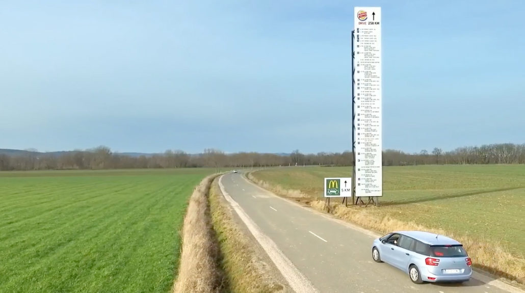
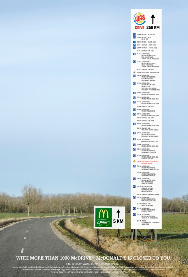
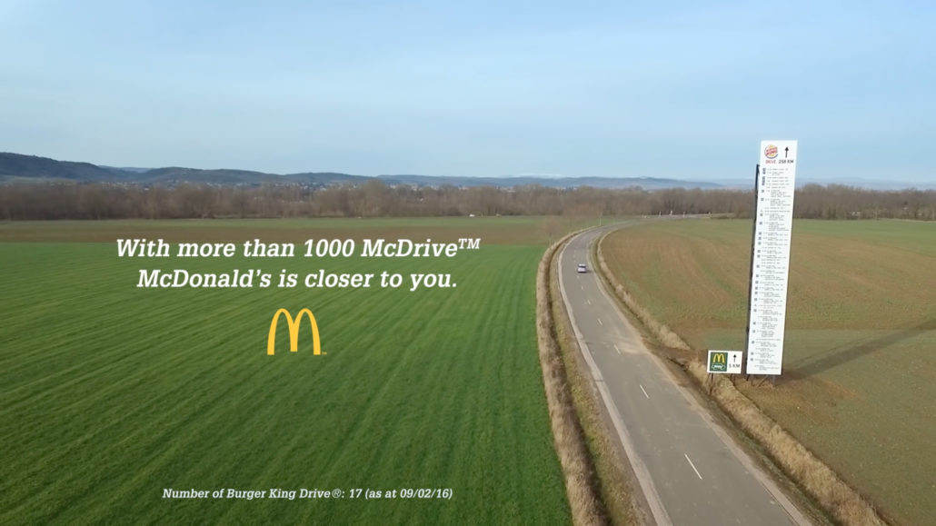
This situation is unique because the billboard was put up not by the company it was advertising, but by its competitor. The sign was a giant ad giving directions on how to get to the nearest Burger King, and it happened to be 258 km away. But, they did it because they could put a sign next to it showing the distance to the nearest McDonald’s, and it was only 5 km away.
This whole little plan would’ve worked without any spectacular show, but it wouldn’t have received the major attention it ended up getting without its unique aspect. The billboard showing the major distance to Burger King also included the directions that a GPS would give drivers, so the BK sign was about 10 times taller than the McDonald’s ad.
Getting the Message Across
It may seem like a weird sign for a fast-food chain, but these two billboards really communicated the main message that McDonald’s wanted customers to know. There are around 1,000 drive throughs with golden arches on the sign, but less than 20 with a king advertising the burgers. So, rather than making people think the food was tastier, the prices were better, or any other value they’ll receive while eating there, McDonald’s wanted to remind customers how much more convenient it is to swing by one of their restaurants. This was an unusual way to show it, but sometimes that’s what it takes.

The “Wow!” Factor
There are a lot of ways for billboards and other ads to be interesting enough for people to talk about them. Sometimes they make use of extremely advanced technologically, so they’re a conversation topic because people are impressed. Other times they somehow solve a problem that people face in their lives, so they’re interesting because of the good they do.
In this case, the billboard was talked about because of how ridiculous it was. It didn’t have any fancy technology, and it hardly had anything pretty to look at. It didn’t do anything new, and it definitely didn’t solve a problem (it’s unlikely anyone would actually use this as their key source of information on how to get somewhere so far away). Instead, people liked it because it was so dramatic. It was funny and silly, and yet it still made the point.
Risks of Mentioning Competitors
Another tricky situation involved here is mentioning the competition. When planning your advertising, this is an important thing to decide about for a few reasons. First, you need to find out what legal restrictions you face. A small mistake could cause you to end up with a costly lawsuit, and that’s not usually worth it.
More importantly, this gives direct advertising for your competitor. Everyone knows that these two chains are against each other, but some companies need to be careful about helping customers realize that other organizations offer similar products or services. Plus, if you’re too mean, it can leave you with a negative impression in the eyes of some customers.

Outside-of-the-Box Billboards
When designing a billboard, it’s a good idea to get a little creative with the style. Remember that you don’t have to be old-fashioned and boring with what you make, and creating something that looks different from all the other signs on the road can really help yours stand out.
The Product Doesn’t Have to Be There
Another good lesson to take from this has to do with the content of the billboard. They generally need to have less information since many people see them but for only a short amount of time, so it’s a good idea to pick only one message. And, it doesn’t have to be about your product. McDonald’s does a lot of marketing about its food, so sometimes they can highlight other values that they can offer to customers – such as convenience.
Want to Make a Billboard that Stands Out?
We love working with creative ideas for our billboards, and we’ll be happy to take on the challenge of something exciting you’ve come up with. Even if you don’t want to build a tower giving directions to your competitor, we can help make your idea a reality.


 787 792 4113

Leave a Reply
Want to join the discussion?Feel free to contribute!