With the dawn of the internet, it’s amazing watching some of the most unique shares go viral. This has to be one of our favorite picks because it involves billboard advertising! Check out these truly unique billboard designs made out of snow! Some are dubbing it snow graffiti.
Have you ever been stuck in a snowstorm and started dreaming of warmer climates? You surely have if you’ve ever spent any significant amount of time in a colder area, as it’s a common problem that everyone complains about. Even though many people seek out tanning beds and other temporary solutions, they always daydream of warm sun and sandy beaches. But, have you ever considered that this might just be a great way to get the attention of your customers? You might not have the budget to send them to an exclusive beach, but what about planting the idea in their head? When images fail, nature speaks!
Billboard Design Best Practices
If you’re looking to create unique billboard designs, there are a few traits that you shouldn’t forget:
- Keep it simple. Stick to one goal for your billboard and don’t distract from that. It’s easy to get carried away when thinking about innovative billboard designs, but too much going on will just confuse people.
- Make it fast. Most viewers take in billboards quickly and look away. The most successful either cause a double take so the potential customer will look back, or stick in the back of their minds so they will think about it later on.
- Have a main takeaway. You ideally want there to be one key message from your billboard. A new product you have, an upcoming sale, or even just a reminder that your business is around. Instead of combining messages, an alternative would be to have multiple billboards with the same theme but different messaging.
This isn’t an exhaustive list of billboard design best practices, but these points are key to successful campaigns.
A Whole New Meaning of “Cool Billboard Designs”
Mexico’s Board of Tourism was trying to attract cold people from their urban homes, and they wanted to motivate them to hop on a plane and come to support the Mexican economy. They took the concept of cool billboard designs to a whole new level when they found the perfect opportunity in the third most populated city in the US. They took advantage of the fact that citizens of Chicago hate the long and cold winters.
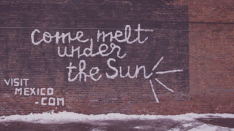
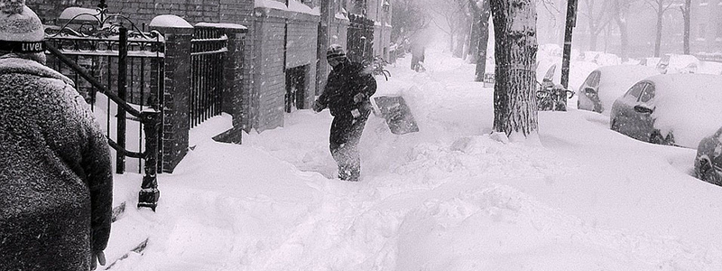
During a spring snowstorm, some artists took to the streets of the city with the goal of using frozen water to spread warm thoughts. They either packed the snow onto surfaces, or they shoveled it off. In both cases, they made it into a message of words that were easily read by viewers. They all discussed how warm it is in Mexico to try and inspire people to book a beach vacation to warm up their bones.
Four Noticeable Slogans
It was mostly text (not images), and the words weren’t random. They used four specific slogans that made these unique billboard designs amazing!
1) “Take your clothes off.”
2) “Beaches with sand this white.”
3) “Mexico: Always a warm Welcome.”
4) “Come melt under the sun.”
Snow Graffiti for Attention
One thing that makes this campaign stand out is how simple these unique billboard designs were when compared to many of the high-tech ads that have been turning heads lately. All it really took was a few guys with snow, shovels, and ladders. They needed something to put it on (or take it off of) and plenty of creativity. It didn’t need virtual reality, artificial intelligence, or any other technology that seems to belong in a science fiction story.
Playing to What People Want
Chicago is famous as being a place with cold and bitter winters, and that fact was absolutely necessary for this campaign. There are many cities that occasionally see snow, but a lot of them generally have temperatures that are much more comfortable. This could have physically been done in warmer places, but it wouldn’t have been as noticeable to the residents because they wouldn’t be bordering on the feelings of desperation for anything hot.
The Results Were Hot
This whole stunt was put on by Lapiz, which is a branch of the Leo Burnett Group. They were working with an area artist, NosE Lanariz, to actually create the messages, and this helped them connect with the local scene.
It’s been viewed as a great use of outdoor media in an innovative fashion, and it’s a nice example of how a low-budget campaign can still have very successful results.
Taking Advantage of Other Ads
There have been plenty of ads talking about the nice weather of Mexico. For example, just think about any commercial for Corona that you’ve ever seen. That means this campaign was benefitting from all of those. The image that the tourism board wanted to convey was already in the minds of customers, so it wasn’t really necessary to show it to them. All they had to do was trigger those thoughts, and once they were pulled out of the depths of frozen minds, they were now associated with the idea of taking a trip to Mexico.
Not Just Snow: Other Unique Billboard Designs
While we’ve been focused on this icy example, there are plenty of other cool billboard designs that take advantage of their surroundings.
Show Your Product With Innovative Billboard Designs
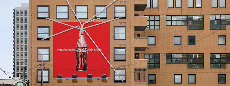
It’s hard to find a more iconic brand than Coca-Cola, but you would think there are only so many ways to put a drink on a billboard. Think again. They ran this clever campaign where giant straws left the top of the sign and interacted with the surrounding environment.
Source: Ads of the World
Everyone knows what a cold Coke tastes like, and seeing this automatically makes you taste the bubbles.
Nature Works With Simple Billboard Designs
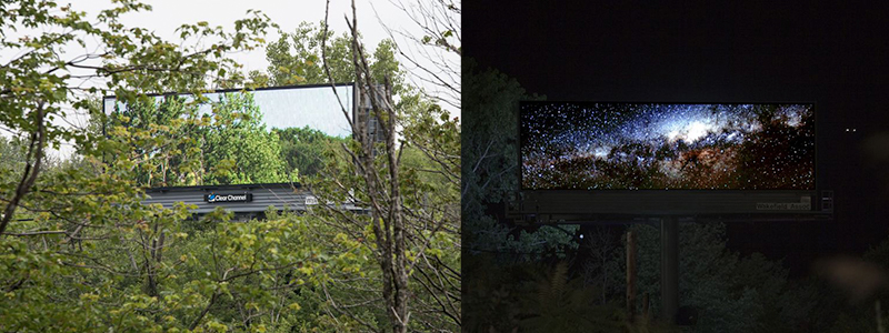
There are situations where people think that billboards distract from the surrounding environment – whether that’s urban or deep in nature. An artist named Brian Kane decided to show how innovative yet simple billboard designs can actually highlight their surroundings. These digital billboards display different images depending on the time of day, but they always show a beautiful scene behind them. Sometimes trees, sometimes celestial bodies.
Source: Today.com
This isn’t really a billboard you’d want your company to create since it doesn’t advertise anything, but it’s a great example of how to get noticed.
Taking Advantage of Digital Billboards
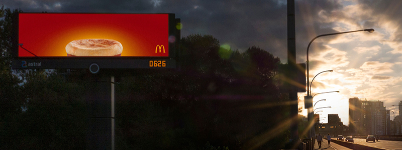
Now for an example where a digital billboard showcases a specific product. A lot of people use digital billboards the same way they would an ad online, but that can miss out on a huge opportunity!
Source: The One Club Awards
McDonald’s used this billboard where an Egg McMuffin mimicked the rising sun, and that really helps it stand out from other digital ads that don’t take advantage of its surroundings.
Breaking Out of Standard Media
Trying to get away from using standard media channels can be very challenging, but it can sometimes be far more successful than sticking to the same methods being used by everyone else – so it’s always worth thinking about. This strategy can have amazing results when you have such an opportunity as the Mexican Board of Tourism did in Chicago.
Even if you don’t have an idea this great, you can still think of innovative ways to use established forms of media. For example, billboards can take advantage of 3D solutions, or they can integrate some sort of technology.
Have You Made It Snow on Your Customers?
Being different and unique is a great way to get a customer’s attention. It’s made even better when it plays upon their desires to solve a problem, as it did in this case. However, don’t make it snow just because you can. If all you are doing is trying to be creative, you might attract attention, but it won’t necessarily increase your sales. So make sure that when you bring the snow, you drop it on the people who are actually ready to book a flight. If you want some feedback on your ideas, reach out to us. We love hearing your creative plans for unique billboard designs, and we’re happy to give advice!


 787 792 4113

Leave a Reply
Want to join the discussion?Feel free to contribute!