Advertising has evolved much over the ages. Before the advent of cheap, high-quality photo printing, painted illustrations were required to cover the large area of billboards. This meant that vintage billboards were works of art in and of themselves. Due to the limitations imposed by the use of illustrations, even the design of such ads was different.
We’ve compiled a list of some of the most effective, beautiful, and well-crafted vintage billboards to analyze and deconstruct.
Vintage Pepsi Billboard
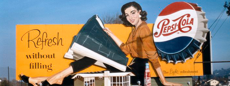
For anyone who has seen the classic 1985 popcorn science fiction film, “Back to the Future”, this billboard might bring back a bit of nostalgia. There’s a scene in which the main character travels from an empty lot in 1955 to the same space in 1985, except the area is now occupied by a newly built suburban neighborhood. While this ad is clearly about Pepsi, it still manages to be highly representative of its era- a time when suburban development was on the rise as the American middle class prospered.
Perhaps the most interesting and striking aspect of this billboard is that it uses the scale in order to defy the expectations of the viewer and catch their attention.
Small objects such as the Pepsi bottle cap are drawn to dwarf traditionally larger objects such as the house being constructed. The technique is quite subtle, yet still manages to disarm and interest viewers.
Vintage Coca-Cola Billboard
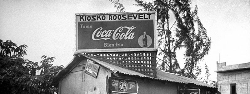
Of course, if we are to look at old Pepsi ads, it is inevitable that vintage Coca-Cola ads be brought up as a contrasting point. The evolution of the marketing behind Coca-Cola is an always fascinating subject. Here is a rare snapshot of the brand’s humble beginnings. Simple, yet ever present, this ad was found in Puerto Rico and was among the first of the brand’s international marketing efforts.
Coca-Cola’s presence has been felt around the world for decades, this image highlights just how long Coca-Cola has been at the forefront of popular culture.
1920’s Spanish Tile Billboard
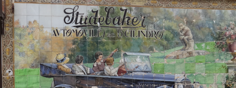
The ad pictured above is from a relatively recent photograph, meaning that this advertisement has remained intact for almost 100 years at this point, all thanks to the quality of craftsmanship and the materials used.
This billboard found in Sevilla, Spain dates back to the 1920s and is a beautiful and quite rare find. Comprised of painted tiles, it has more in common with traditional Spanish art than advertising materials. The amount of detail, care, and raw artistry that has gone into this piece come off as incredibly uncharacteristic with what audiences have come to expect out of ads. Thrilling and interesting they may be- modern ads are ultimately understood to be disposable and fleeting.
Motorcar Silhouettes Retro Billboard
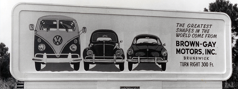
Flat design is highly distinguished by shape and color instead of perspective, lighting, and detail. These two elements are commonly found being manipulated in vintage ads. This ad is a prime example of how shape can be used and taken advantage of in an ad.
This ad for some motorcars is focusing specifically on the shapes of the front of each car, relying upon the highly distinctive and iconic silhouettes of the vehicles to add impact to the billboard’s message.
1967 Chevrolet Camaro Vintage Billboard
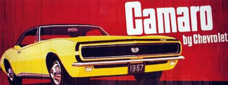
This famous ad for the then brand-new Chevrolet Camaro is worth highlighting thanks to its striking use of bold colors.
As previously mentioned, color is the other side of the coin when it comes to flat design. While the last advertisement made great use of shapes and silhouettes, this Camaro ad chooses to shift the focus mainly to its usage of color, though the shape here is still very distinctive and clear.
The high contrast between the yellow, red, white, and black, makes it stand out and leaves an impression in the mind of the viewer. Such imagery has had a drastic impact on popular culture, inspiring visual effects in movies such as Quentin Tarantino’s “Kill Bill” and in video games such as “The House of the Dead”.
2.5D Oldsmobile Retro Billboard
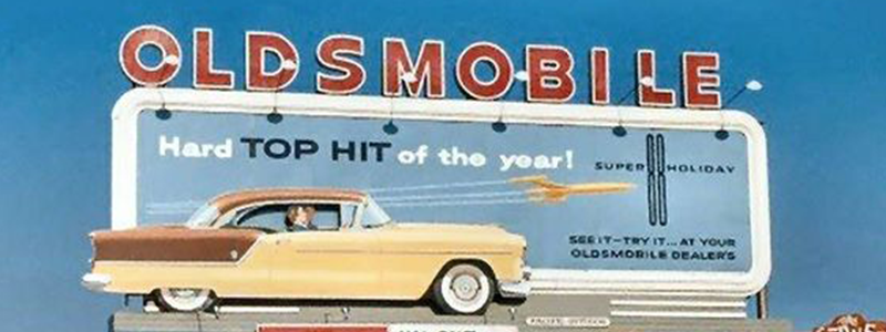
In this example, the vintage billboard is comprised of multiple 2D elements layered in such a way to give the impression of depth, guiding the eye from the front left to the back right.
The beauty of billboards as an advertising medium comes from the fact that they exist within three dimensions. Many modern billboards take advantage of this by making use of models and other 3D constructs. As previously mentioned, however, many vintage billboards favored flat designs and thus approached the use of the Z-axis in a different way, utilizing a method
Interested in more creative outdoor media? Check out our article on funny signs and billboards.


 787 792 4113

Leave a Reply
Want to join the discussion?Feel free to contribute!